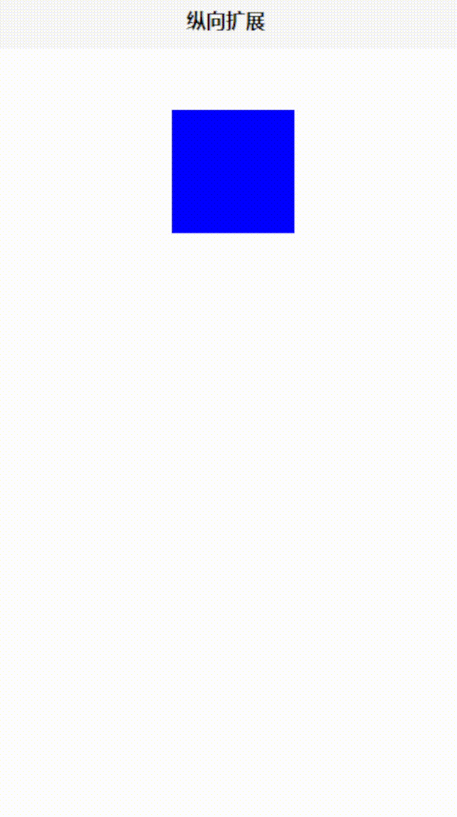
CSS 纵向扩展动画
发布时间:2023-12-28 23:44:14
上干货
<template>
	<!-- @mouseenter="startAnimation" 表示在鼠标进入元素时触发 startAnimation 方法。
	@mouseleave="stopAnimation" 表示在鼠标离开元素时触发 stopAnimation 方法。 -->
	<!-- 容器元素 -->
	<div class="container" @mouseenter="startAnimation" @mouseleave="stopAnimation">
		<!-- 旋转的方块 -->
		<div class="box" :class="{ 'animate': isAnimating }">
			<!-- 元素内容 -->
		</div>
	</div>
</template>
<script setup>
	import {
		ref
	} from 'vue';


	const isAnimating = ref(false); // 控制是否应用旋转动画的响应式状态
	function startAnimation() {
		// 鼠标进入容器时,启动动画
		isAnimating.value = true;
	}

	function stopAnimation() {
		// 鼠标离开容器时,停止动画
		isAnimating.value = false;
	}
</script>
<style>
	.container {
		/* 定义容器宽度和高度 */
		width: 100px;
		height: 100px;
		margin-top: 50px;
		margin-left: 40%;
	}

	.box {
		/* 定义方块宽度和高度 */
		width: 100px;
		height: 100px;
		background-color: blue;
		/* 定义过渡效果 */
		transition: transform 0.5s;
	}

	/* 应用动画类 */
	.box.animate {
		-webkit-animation: scale-up-tr 0.4s cubic-bezier(0.390, 0.575, 0.565, 1.000) both;
			        animation: scale-up-tr 0.4s cubic-bezier(0.390, 0.575, 0.565, 1.000) both;
	}

	/* 定义动画 */
	@-webkit-keyframes scale-up-tr {
	  0% {
	    -webkit-transform: scale(0.5);
	            transform: scale(0.5);
	    -webkit-transform-origin: 100% 0%;
	            transform-origin: 100% 0%;
	  }
	  100% {
	    -webkit-transform: scale(1);
	            transform: scale(1);
	    -webkit-transform-origin: 100% 0%;
	            transform-origin: 100% 0%;
	  }
	}
	@keyframes scale-up-tr {
	  0% {
	    -webkit-transform: scale(0.5);
	            transform: scale(0.5);
	    -webkit-transform-origin: 100% 0%;
	            transform-origin: 100% 0%;
	  }
	  100% {
	    -webkit-transform: scale(1);
	            transform: scale(1);
	    -webkit-transform-origin: 100% 0%;
	            transform-origin: 100% 0%;
	  }
	}

</style>
教学视频地址
文章来源:https://blog.csdn.net/weixin_54226053/article/details/135279555
本文来自互联网用户投稿,该文观点仅代表作者本人,不代表本站立场。本站仅提供信息存储空间服务,不拥有所有权,不承担相关法律责任。 如若内容造成侵权/违法违规/事实不符,请联系我的编程经验分享网邮箱:veading@qq.com进行投诉反馈,一经查实,立即删除!
本文来自互联网用户投稿,该文观点仅代表作者本人,不代表本站立场。本站仅提供信息存储空间服务,不拥有所有权,不承担相关法律责任。 如若内容造成侵权/违法违规/事实不符,请联系我的编程经验分享网邮箱:veading@qq.com进行投诉反馈,一经查实,立即删除!